Like this:
decor pad via the Mustard Ceiling
In a post about Pops of color: CORAL!! Woo HOO!! LOVE IT
and then I saw this:
Tobi Fairly via The Mustard Ceiling
and I'm pretty sure I fell in love! I realize this is an entry way but I want my dining room to look like THIS! Just like this! LOVE the blue and white rug with the coral- it makes it a little more fun and relaxed
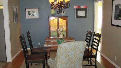
This:
Just wasn't working for me anymore. I love the color on that wall but the whole dining room looks so drab to me- its all dark, and mostly brown, so the dark slate color just wasn't working. I need something cheerier. So I decided on pink (well let's call it coral so P doesn't freak out... ) But since then I've been on the war path trying to find the perfect "coral" color but it's hard! I found what is seemingly a PERFECT choice

Bloom by Sarah Richardson paints . . .only available in Canada.... sad.
Seriously sad because look at all these fun colors
So I've begun my search back here in the US. AND I found this paint visualizer tool on Sherwin Williams website which is fun- but take it with a grain of salt because the colors I was picking are actually pretty and this is what they were looking like on the computer...
a little neon- I realize- but actually it's pretty nice in person.
I've got the paint swatch sitting up on the wall right now, trying to decide how dark I want to go. But anyways- isn't it a fun tool? To get an idea of what your actual room will look like? I thought it was
Next step painting a few swatches on the wall to see which looks best and then I'll pull the trigger!
I've also found this rug at West Elm that might be in the cards for us as well.. . .
I just worry the end stripes will look too red- I'm going to the store soon though to find out!!
Dining room overhaul coming to a blog near you...and soon :)


No comments:
Post a Comment